The app that positively gets you through your
pregnancy and the postpartum period.

Timeline
9 Days
Team
Onur Senbas, Camille Mennesson
Summary
We created a planning and tracking app for pregnant women and parents. Our mission was to investigate how we could help people during and after their pregnancy.
Role
User Research, Competitor analysis, User persona, User journey, Style guide, Design system, UX/UI Design, Branding, Prototyping.
Deliverables
A high-fi prototype, Landing page, and Presentation deck
Introduction
The Brief
Delivering a wellness tracking app that helps people to live healthier lives. It was really good that finally, we had more time to work on our project. We spent 3 days on research and the rest of the time developing the UI for our app.
We wanted to provide help to pregnant women during their pregnancy and the postpartum period. For that, we wanted to design an app focusing on pregnancy.
Empathize
Getting to know the user
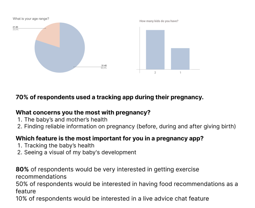
For the research first, we created a survey to collect information from pregnant women and also from mothers. We also asked in which phase of pregnancy they had the most difficulty. What data do they want to visualize and track during pregnancy? What are the difficulties after pregnancy?
Interviews
Pregnancy not only involves women but also men whether they are fathers or not. We interviewed 3 types of target users: mothers, pregnant women, and fathers. Throughout our research, we found 3 key insights:
Parents (especially women) feel a real lack of follow-up and support after birth.
“You see so many doctors and have regular appointments while you’re pregnant then when you actually go back home with your newborn you can feel very alone and hopeless. The only medical professional you see is a nurse a few weeks after birth that just asks about your baby, but nothing about you…”
Pregnant women and mothers have a lot of difficulties finding the right specialist that will fit their problems.
Women suffer from a lack of preparation for pregnancy, birth & after-birth.
“Even though I read a lot and listened to podcasts about pregnancy I did not feel ready at all when it happened. I lacked so much important information that could have changed the decisions I took when giving birth.”
How might we...
We completed the qualitative and quantitative research and we defined three ‘How might we’-questions to take with us throughout the process.
How might we help mothers with Body & mind rehabilitation after birth?
How might we help mothers to find the relevant specialist?
How might we help mothers to find mothers who had to face the same issue before?
Competitor Analysis
Investigating what is already in the market
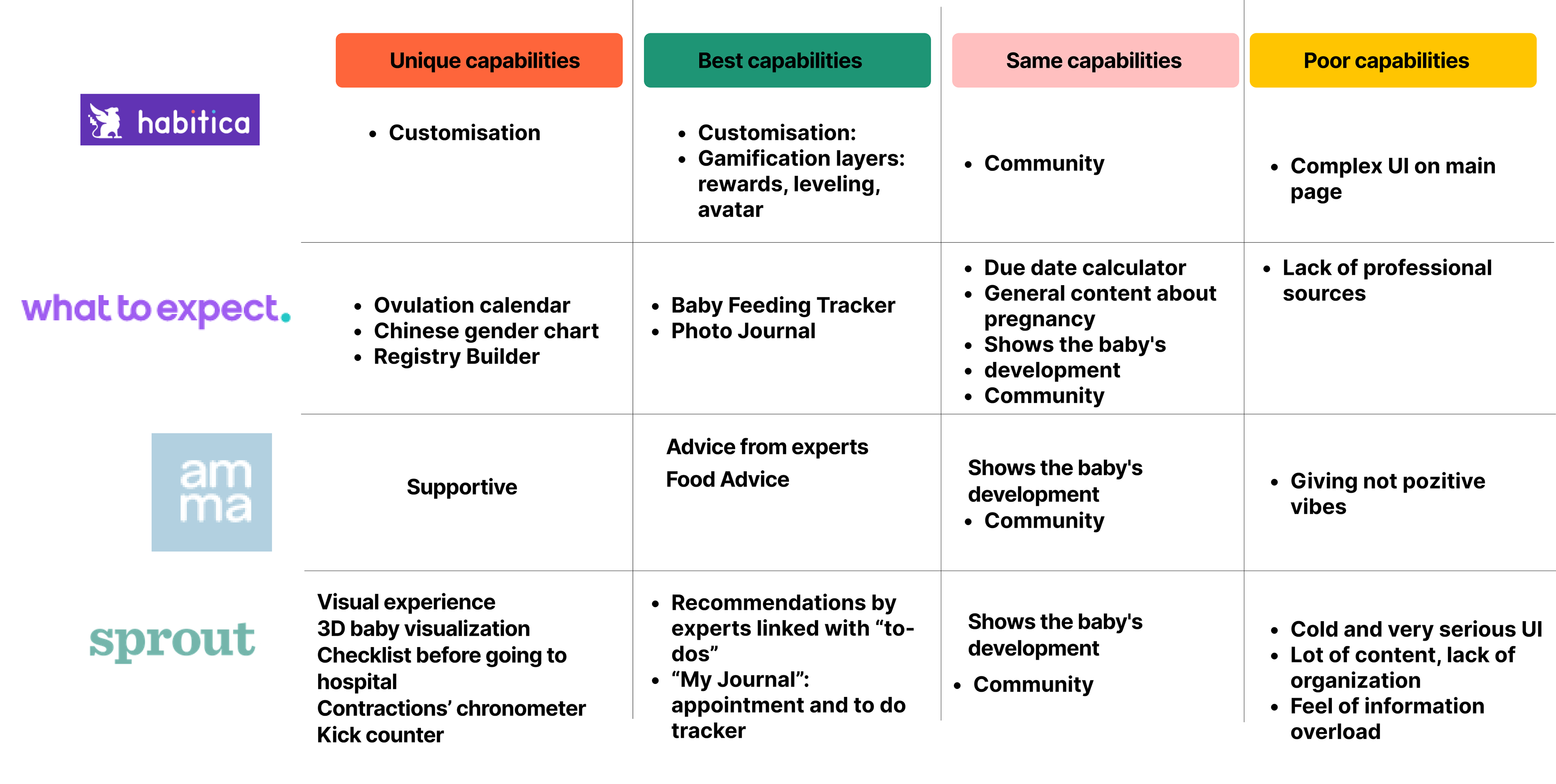
There are plenty of pregnancy apps on the market. We picked as a competitor; Sprout, amma, and What to expect, and to give us an idea of goal-setting and tracking apps we pick habitica
Competitor Analysis
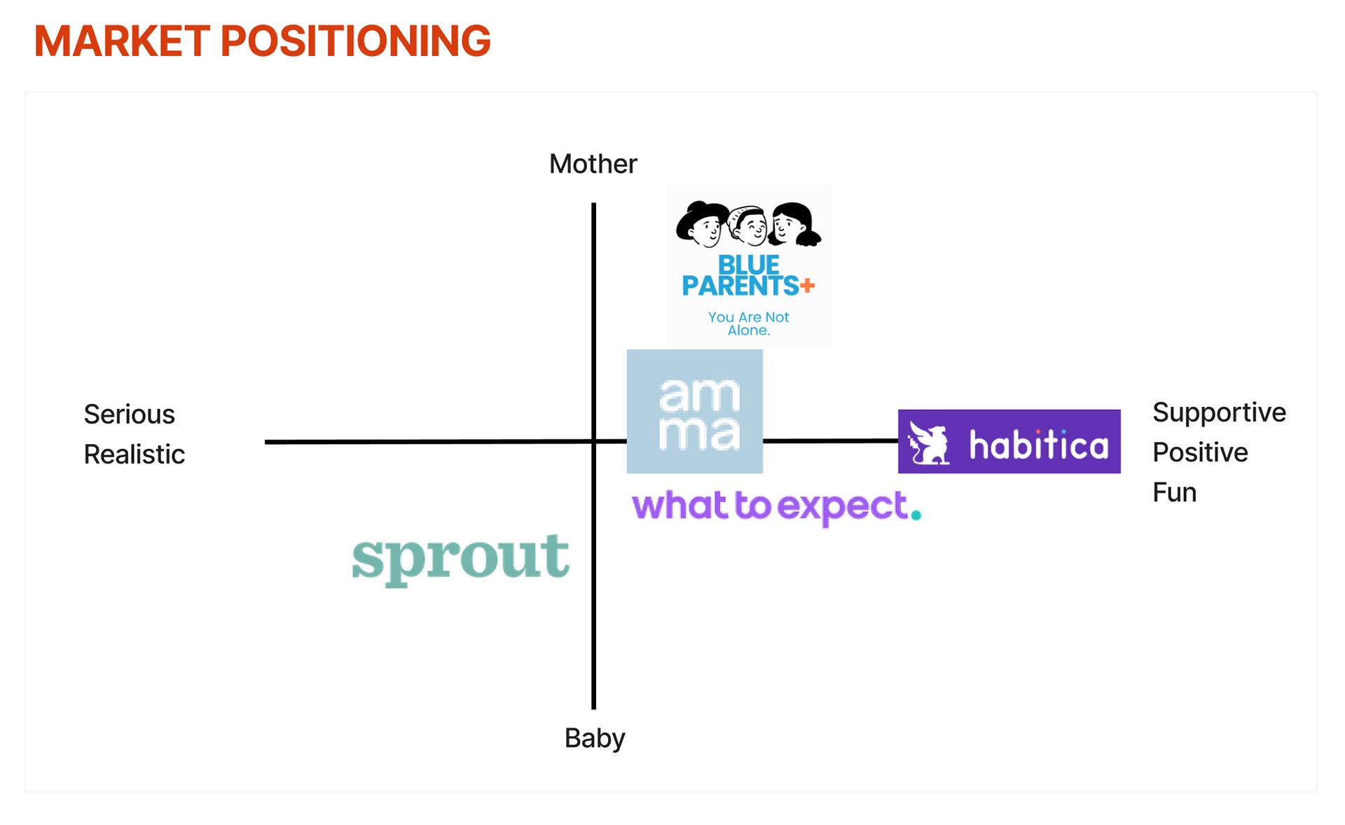
Market Positioning
Visual competitor analysis
Collecting visual information on the competitors made us better understand the way these websites with their users. They keep their layout clean, with as minimal distractions as possible.
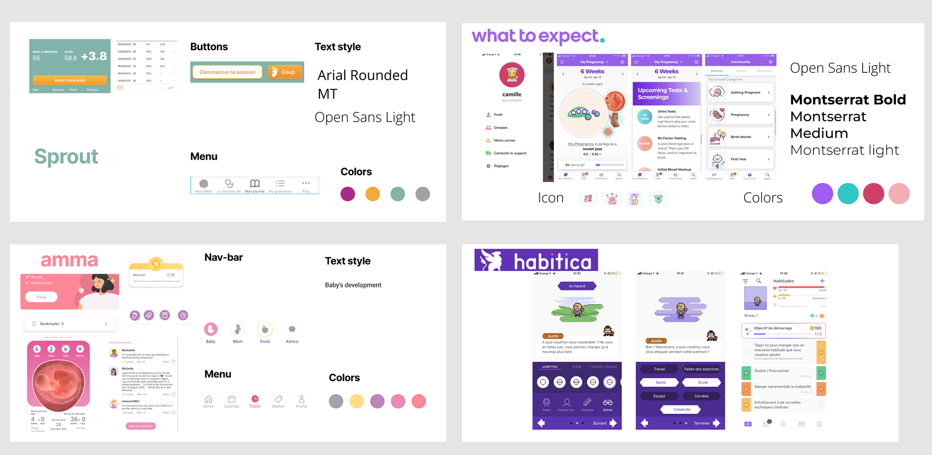
Visual competitor analysis
Define
User Persona
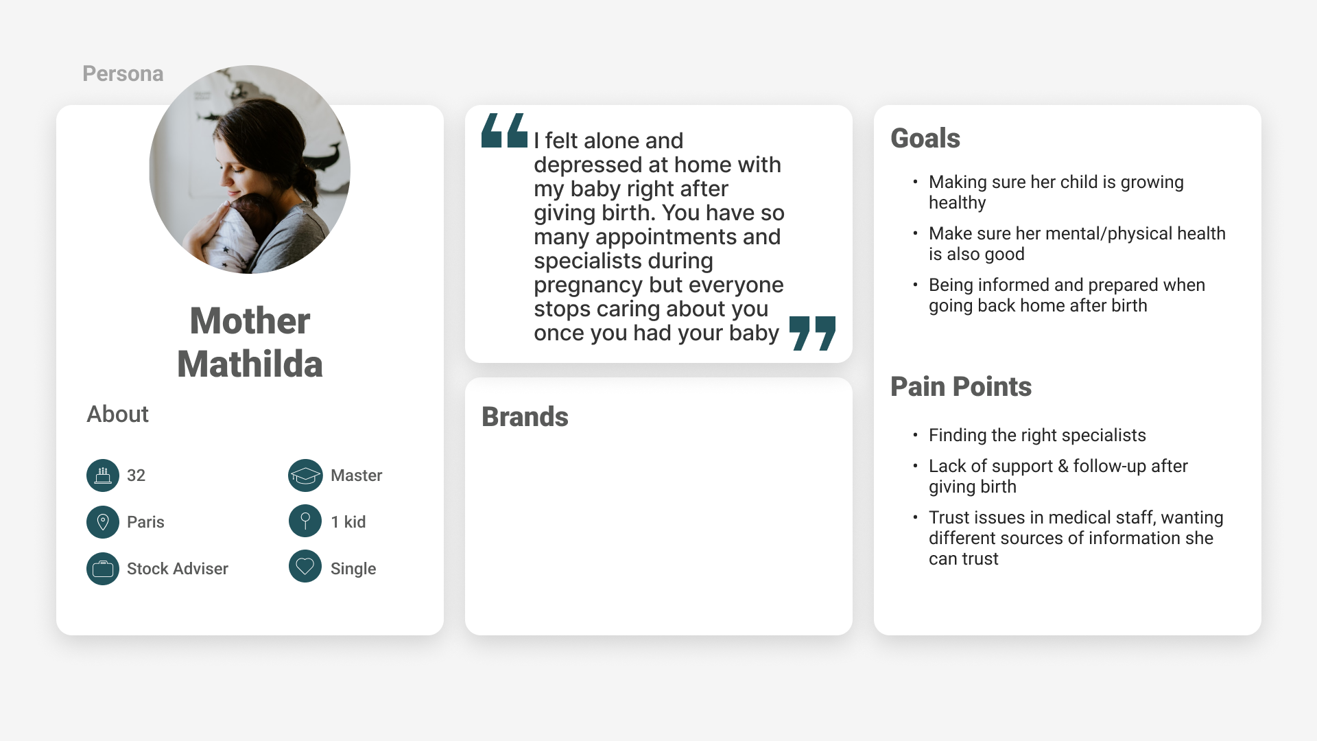
From our research results, we created our user persona mother Mathilda
Mathilda is a single mom who has recently given birth. She is 32 years old, lives in Paris, and has a full-time job.
“I felt alone and depressed at home with my baby right after giving birth. You have so many appointments and specialists during pregnancy but everyone stops caring about you once you had your baby”
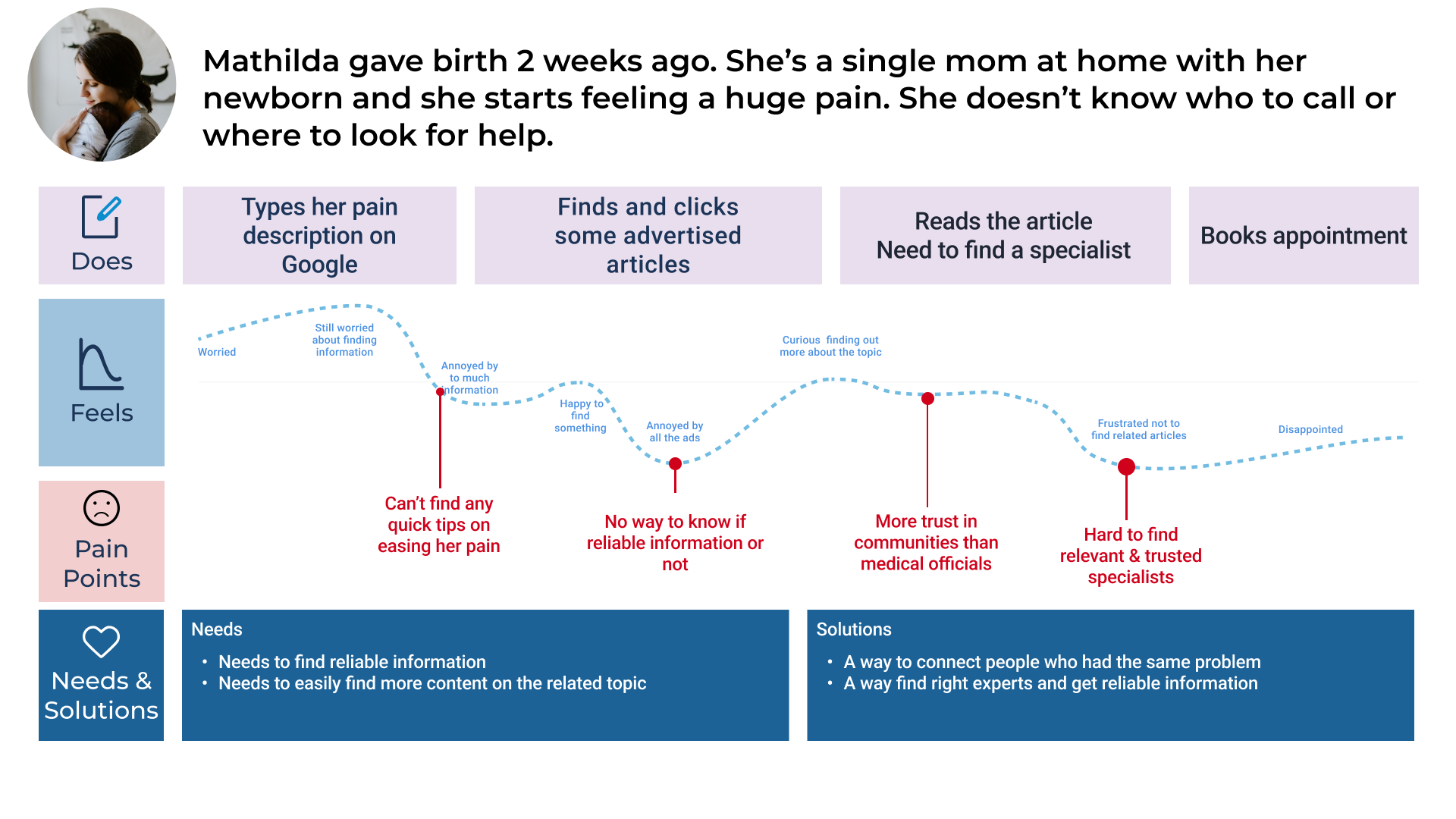
User journey
For a better understanding of Mathilda,
we created the below user journey.
Opportunity
A way to connect people who had the same problem
A way to find the right experts and get reliable information
A way to find the right experts and get reliable information
The challenge
Problem statement
We observed that Mother Mathilda needs a way to find more physical and psychological support after giving birth because she’s in pain and she has no one to talk to.
Hypothesis statement
We believe that giving Mother Mathilda easy access to mind and body after-birth exercises will help her go through her postpartum period. We will know we are right when we see improvement in the qualitative data that we collect from our users.
Information Architecture
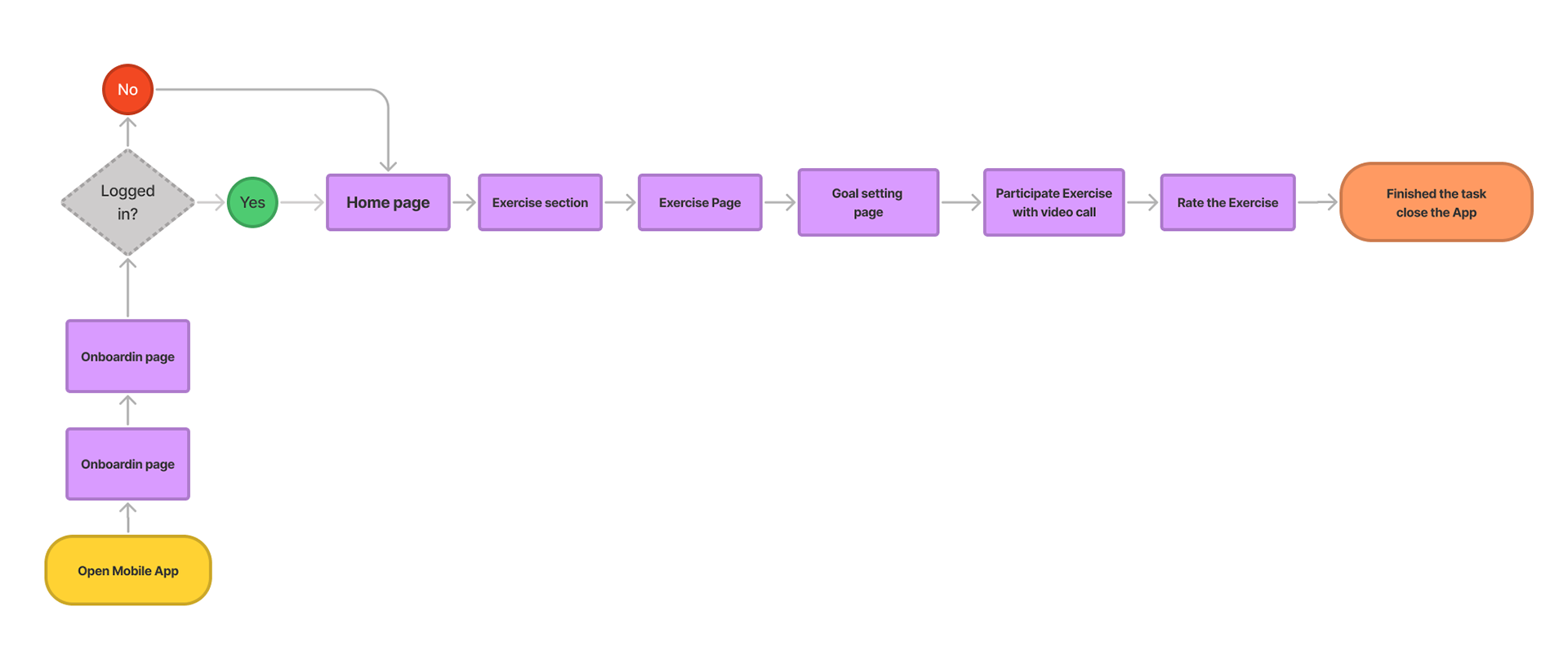
User flow
Via the jobs-to-be-done method, we wanted to see what main job we could base our user flow on. We focussed on enrolling and participating in a workshop. This includes the whole process because the user needs to enroll in a workshop first.
Ideate
We used a Crazy 8s method to think of possible solutions for our problem, and we did some lo-fi wireframes.
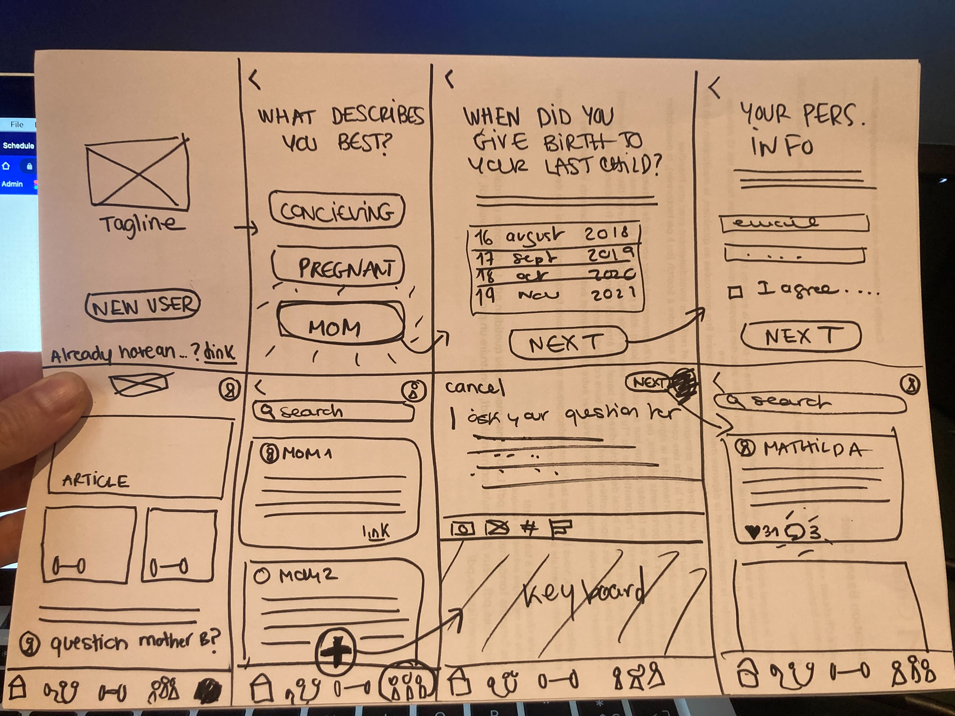
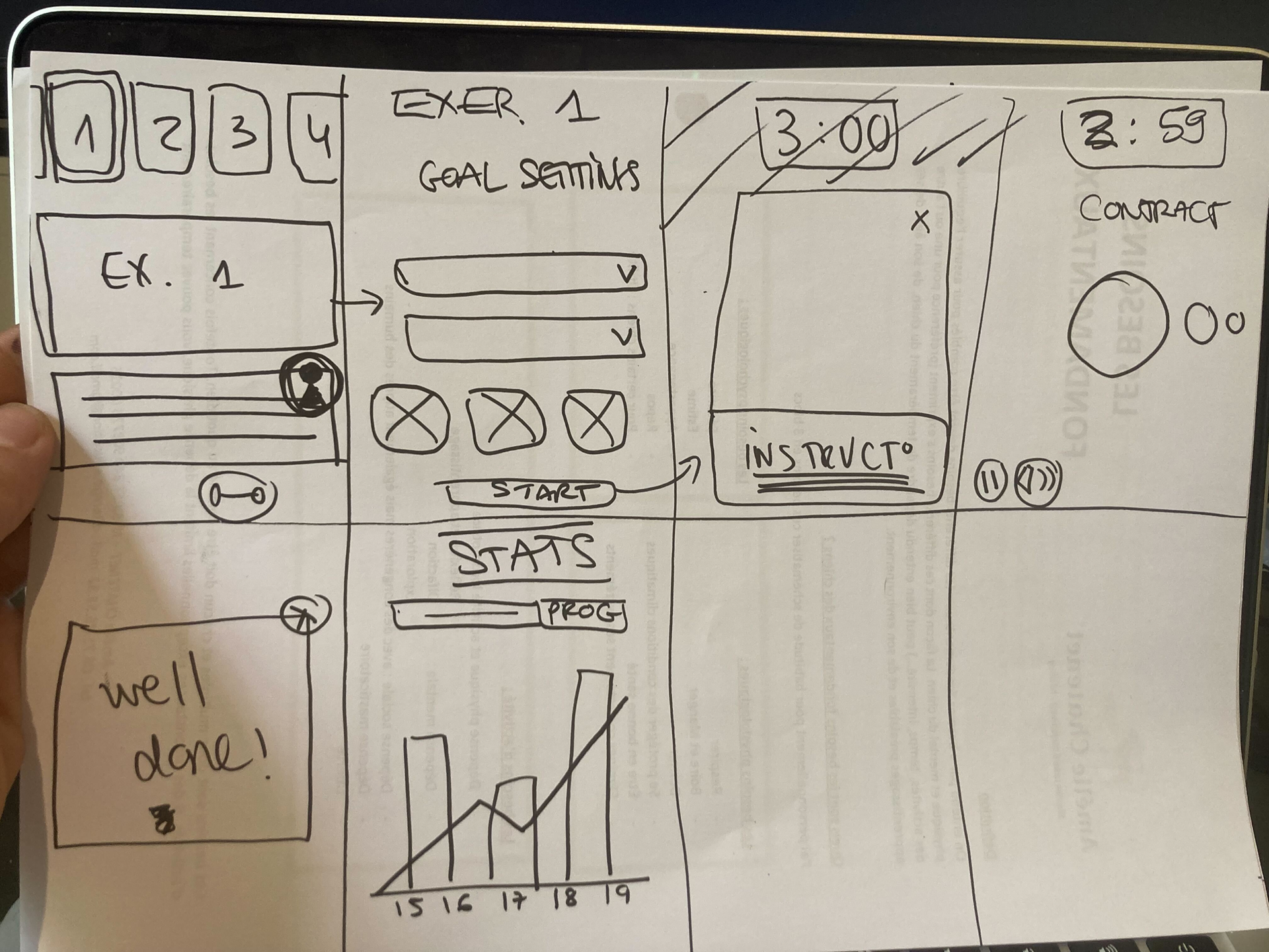
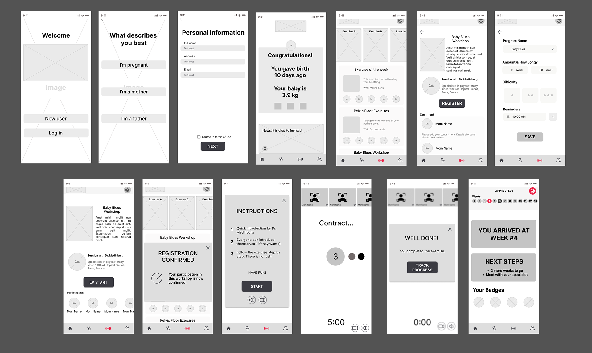
Mid-fi
Here you see a part of the mid-fidelity prototype. The goal is to enroll in a workshop and participate in it.
Results
After testing the mid-fi prototype, we found some problems with our design.
70% of people completed the task
On the personal information input page, people got confused
User rating: 7
We changed our onboarding structure and make everything more clear.
We added a progress bar on the top. This way people can see which page they are on and how many pages there are in total.
We added a little description of each input field that we asked for. This way people can know why we need their location and other necessary information that we asked for.
We added a progress bar on the top. This way people can see which page they are on and how many pages there are in total.
We added a little description of each input field that we asked for. This way people can know why we need their location and other necessary information that we asked for.
We didn’t have to change our structure and user flow because we see that from the prototype test results it was clear for users.
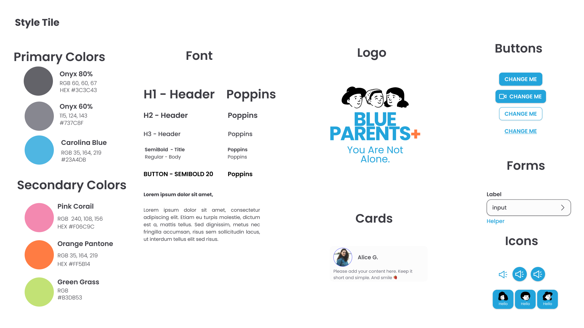
Style guide
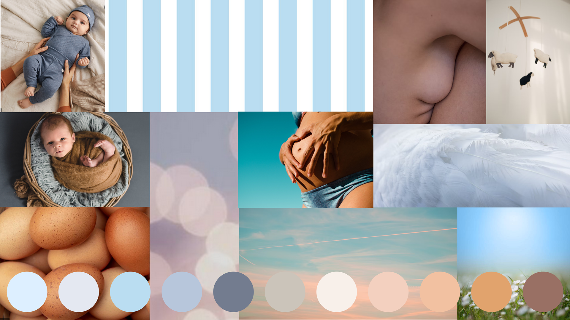
Moodboard
Before creating our high-fi, we started to define our brand style and design principles.
To get some inspiration we collected colors, pictures, and patterns to help us and created our moodboard.
To get some inspiration we collected colors, pictures, and patterns to help us and created our moodboard.
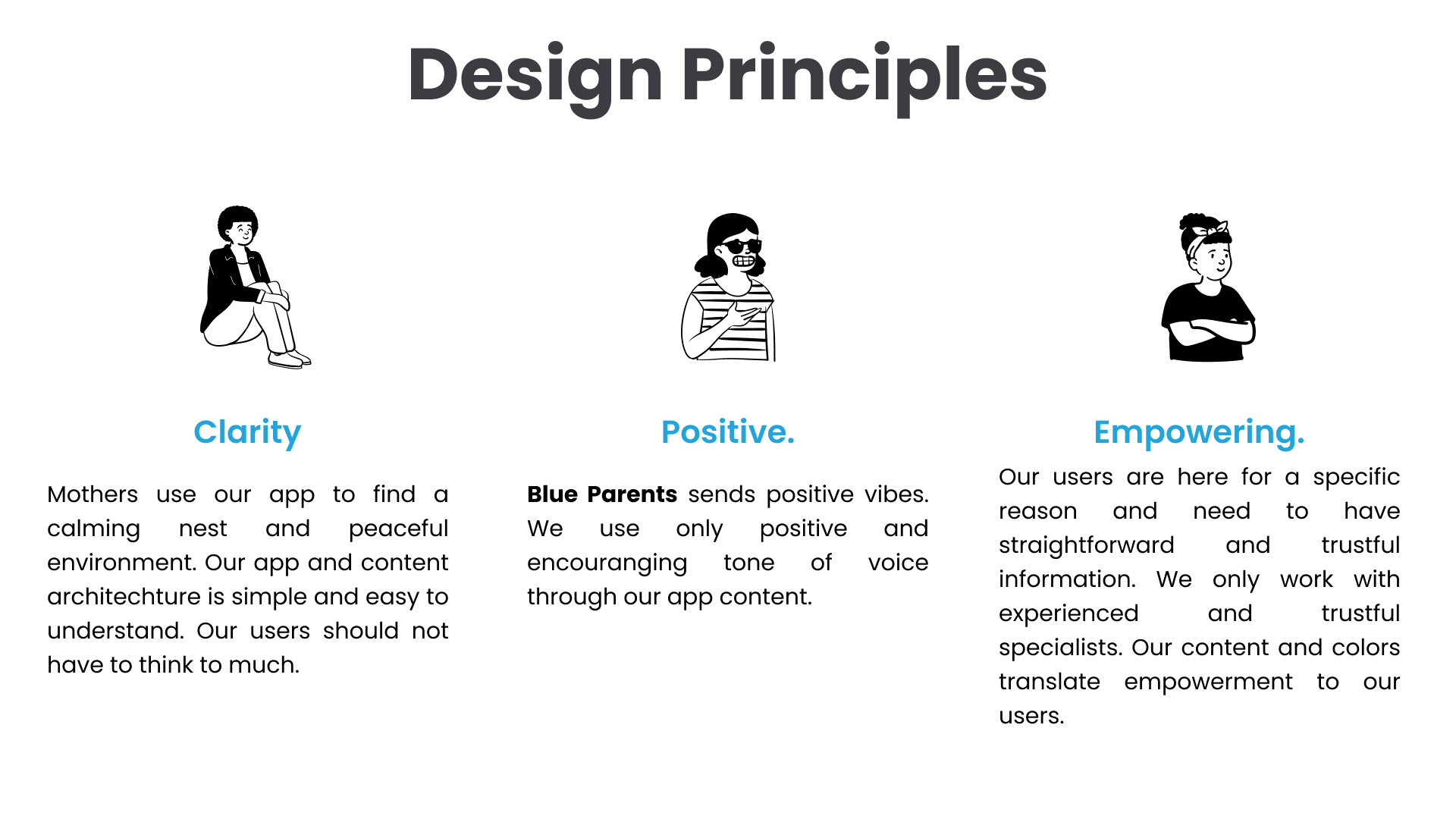
Principles
We defined our design principles to make our app and landing page consistent.
Solution
High fidelity prototype
We used our mid-fi results to include changes in our high-fi and styled our prototype with the help of our Style Guide.
The Blue Parents app is a pregnancy tracker that helps the user to monitor the development of the child and the mother, attend postnatal workshops, and follow their personal development.
Landing page
After completion of the app, the next step was to create a landing page to transfer our mission to the user. Important for us was to make it clear to the user how the app works, what features they can expect, what other users are saying about the app, and where they can download it.
We conducted a desirability test to find out what the user's attitudes are toward the Blue Parents app.
Conclusion
Key Takeaways
Working with a niche target group was challenging
It was hard to find interviewees (pregnant women & mothers)
Very good to practice more on creating a new brand from scratch based on findings & persona
It was hard to find interviewees (pregnant women & mothers)
Very good to practice more on creating a new brand from scratch based on findings & persona
Next steps
The first step would be to test the app specifically for a longer period with our target group, pregnant women and women who are in their postpartum period. And interview them afterward to collect information on how they experienced the app and if it truly improves their lives on a daily basis. We would also love to do more in-depth research on their behavioral patterns with digital devices. To see if we can find some new ideas to make this app even more specialized for pregnant women.
Thank you for reading!