
Team
Onur Senbas, María Belén Vargas Rubio , Sofia Castiñeiras
Role
User Research, Competitor analysis, User persona, User journey, Style guide, Design system, UX/UI Design, Prototyping.
Summary
We made improvements on the customer journey from page to check out
Timeline
9 Days
Deliverables
A high-fi prototype
Introduction
The Client
La Sirena is one of the biggest supermarket chains in Spain.
La Sirena's story begins in 1983 when two good friends, Ramona Solé and Josep Mª Cernuda, decide to start the innovative La Sirena project. Both had experience in the world of frozen products and had a great business idea: self-service frozen products. Bulk products began to gain ground in Spain.
The good acceptance by consumers, constant growth in sales, and the opening of new stores attracted the attention of Corporación Agrolimen, S.A. which, in the year 2000, became part of the shareholders with the gradual acquisition of shares, supporting the company's growth. In the first half of the 2000s, the company strengthened considerably, with the professionalization of management, the implementation of new systems and processes, the expansion of the product range, the constant opening of stores, and, in 2003, the start of store openings in Madrid.
The Brief
La Sirena assigned us the task to improve the customer journey from the home page to checkout. The stakeholder wants to focus home page and the product page specifically.
Empathize
Getting to know the user
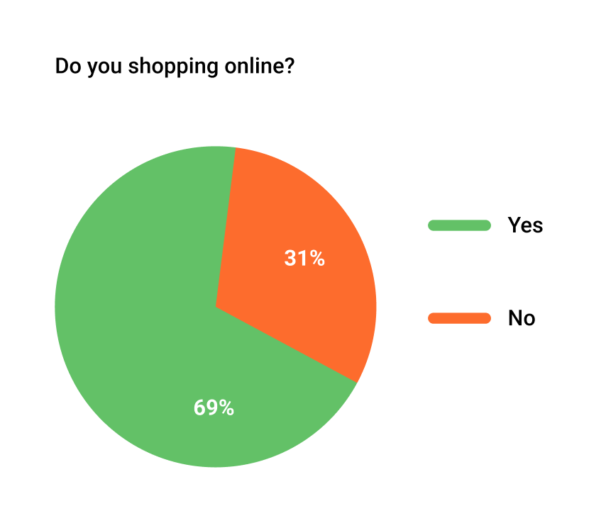
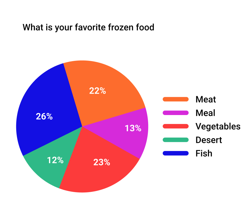
For the research, We were able to use an external research company for our survey with 100 people. We also asked; Are you familiar with La Sirena's e-commerce? Have you ever shopped online? What has worked? What has not so much? What would you like to see on their website?
Why do you choose to buy at La Sirena?
Why do you choose to buy at La Sirena?
We gathered insightful information from our survey.
Interviews
In addition to the survey, we undertook 4 user interviews.
We focused on people are who already shopping from La Sirena. For that, we went to the psychical store and asked people about their experience with La Sirena's website.
"I am usually shopping online but with La Sirena, it is really hard to"
"There are too many ads and banners on the home page it is really distracting and I cannot find what I am looking for"
"To able to shop online, you have to set your delivery date first which is time consuming"
How might we...
We completed the qualitative and quantitative research and we defined three ‘How might we’-questions to take with us throughout the process.
How might we simplify the whole buying process?
How might we organize the landing page to increase the conversion rate?
How might we simplify the home page?
Competitor Analysis
Investigating what is already in the market
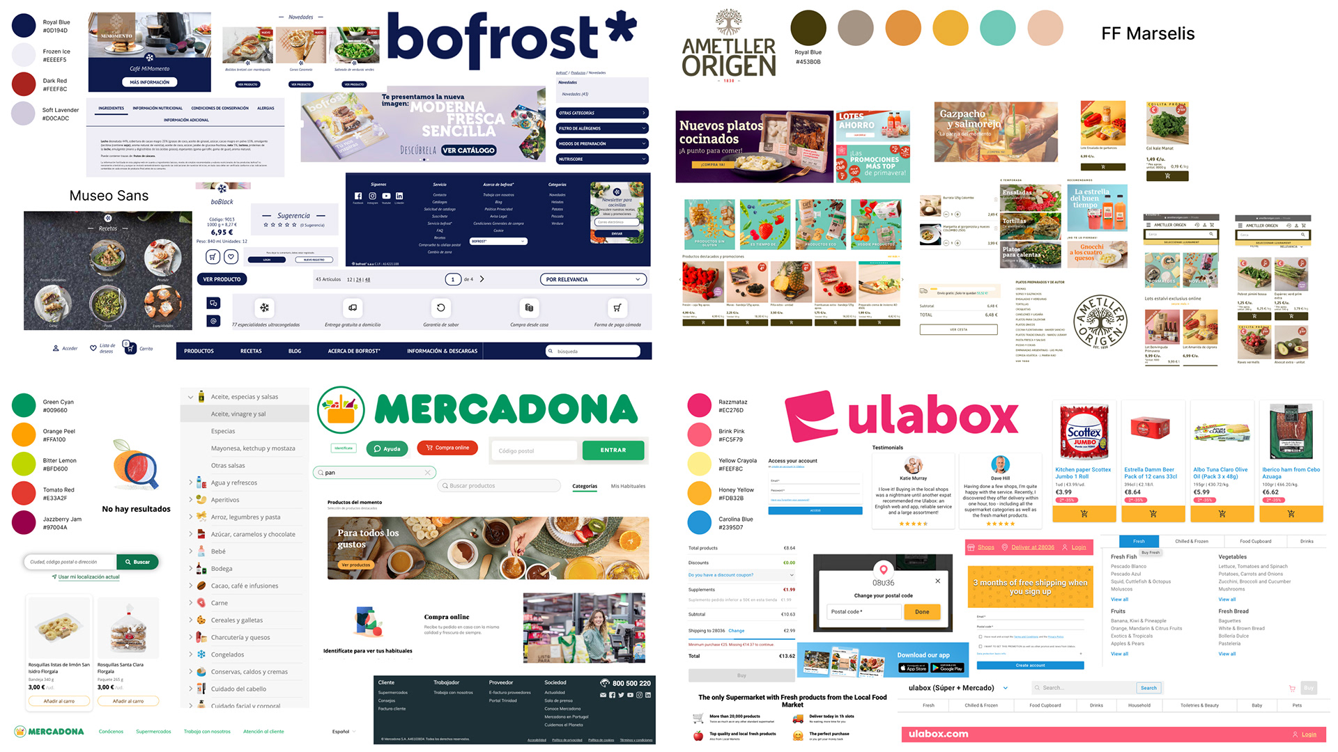
We got information from la Sirena about who they see as competitors. And we added our own competitors to this list and made a competitor analysis.
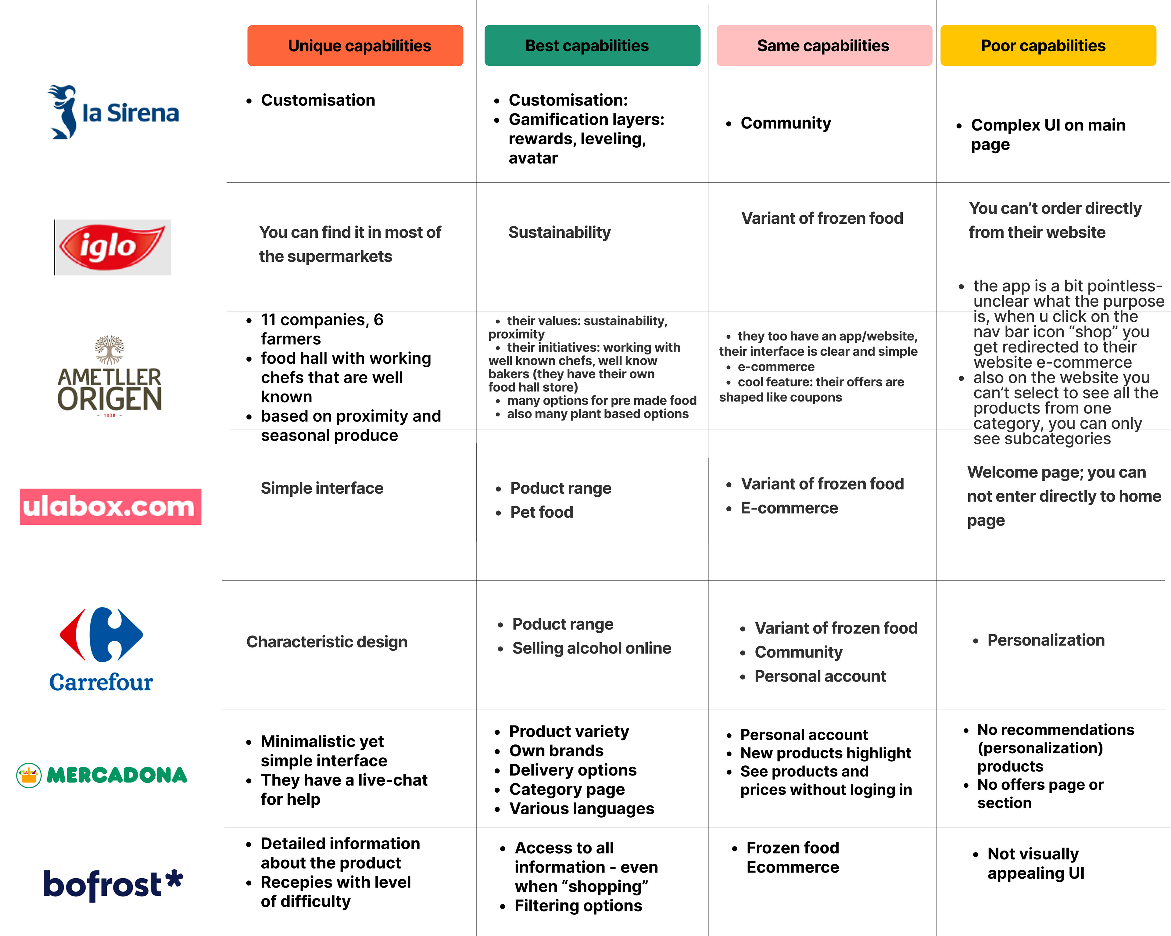
Competitor Analysis
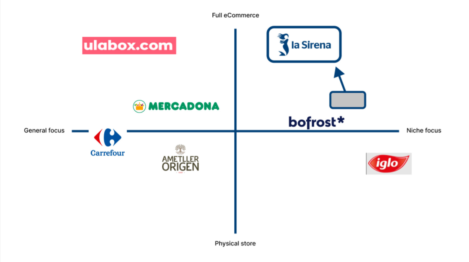
Market Position
Visual competitor analysis
Collecting visual information on the competitors made us better understand the way these websites with their users. They keep their layout clean, with as minimal distractions as possible.
Define
Identifying user's problems
We collected some demographics from the user research and tried to verify La Sirena's existing user persona. In the end, we did collect enough information to create our new user persona based on the research.
81% 72% 95%
38-52 years Female Spanish
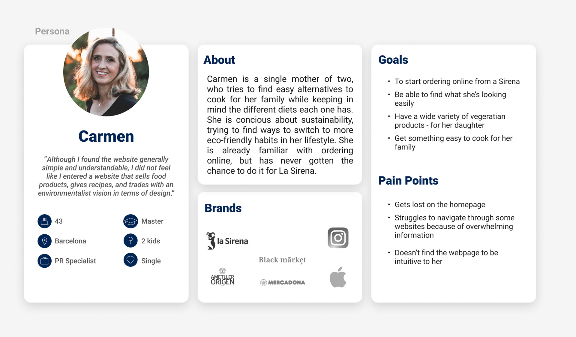
User persona
Carmen is a single mother of two, who tries to find accessible alternatives to cook for her family while keeping in mind the different diets each one has. She is conscious of sustainability, trying to find ways to switch to more eco-friendly habits. She is already familiar with ordering online but has never gotten the chance to do it for La Sirena.
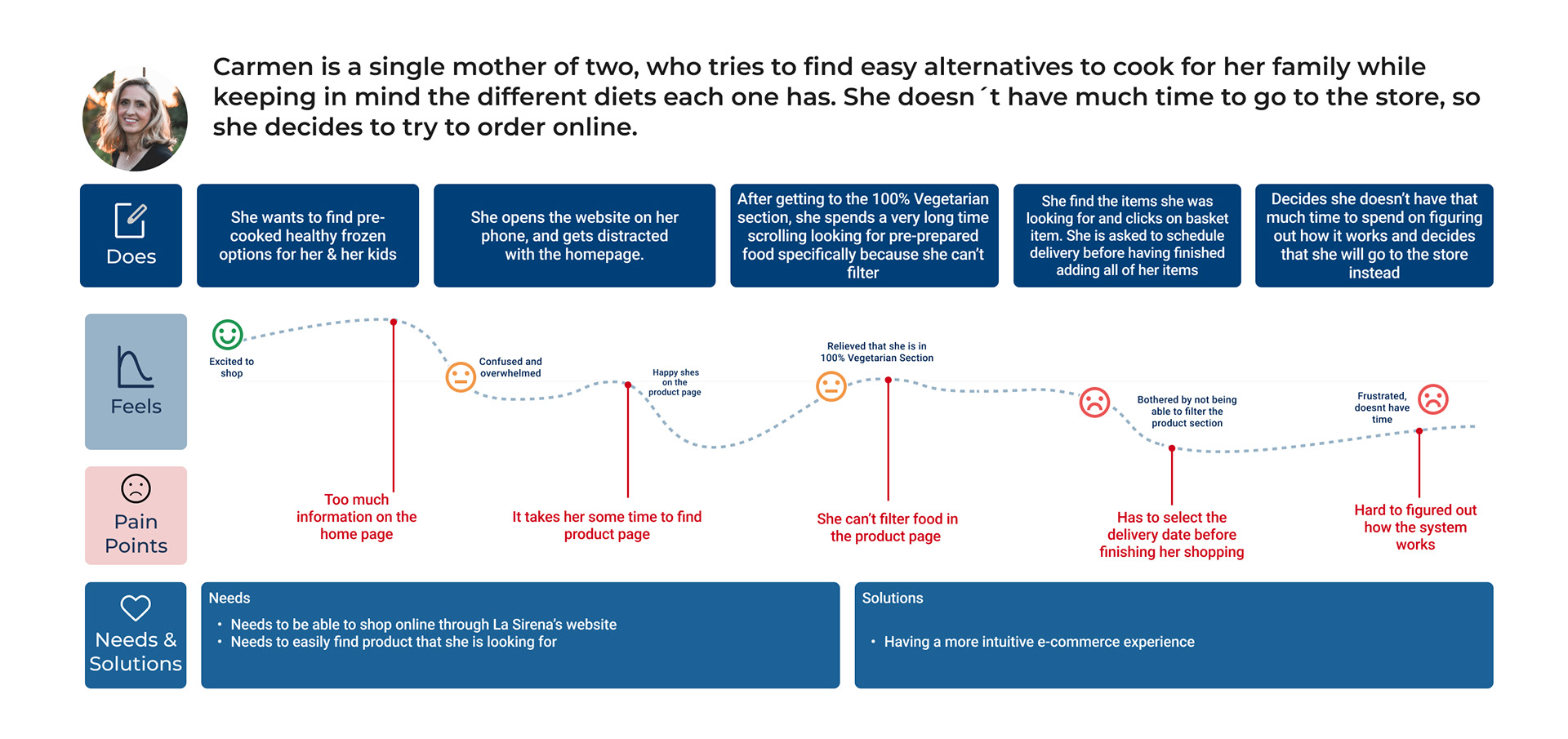
User journey
We took Carmen on a journey of what would happen if she had to decide to shop online from La Sirena's website.
The Challange
Problem statement
La Sirena’s e-commerce was designed to provide a quicker alternative to in-person shopping. We have observed that the current web page is not meeting the right requirements to find products easily and understand the steps to follow which is causing a decline in the conversion rate to our business.
Hypothesis statement
We believe simplifying the homepage and making the product page more intuitive for La Sirena’s e-clients will achieve an increased conversion rate.
We will know we are right when we see fewer users abandoning the website and more completed sales.
We will know we are right when we see fewer users abandoning the website and more completed sales.
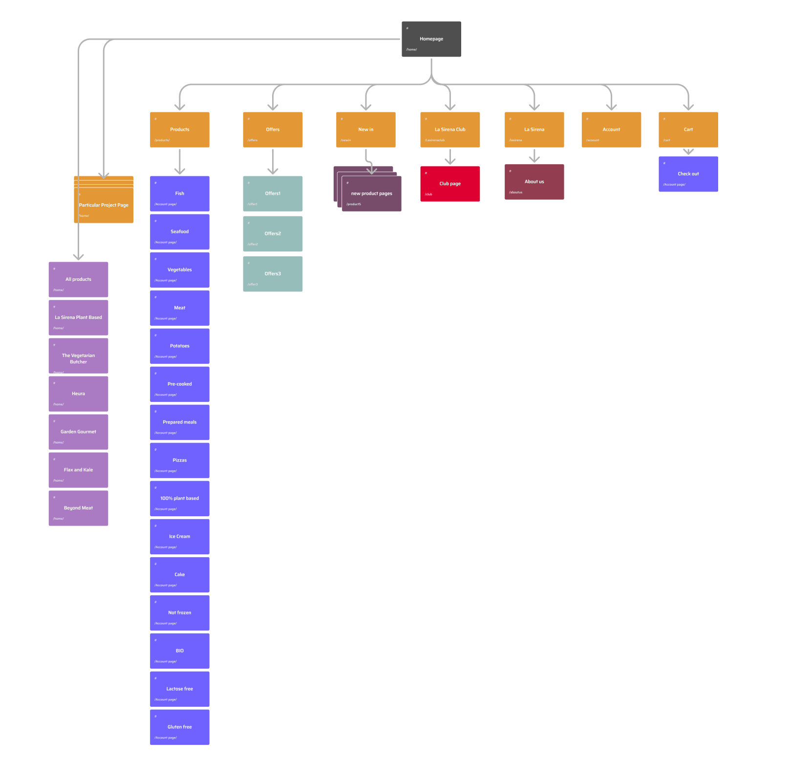
Information Architecture
Mapping the structure of the website
Organizing the information in a workable structure is the next step. This gave us clarity about which screens we had to design and how many steps the user needs to take to complete the user flow.
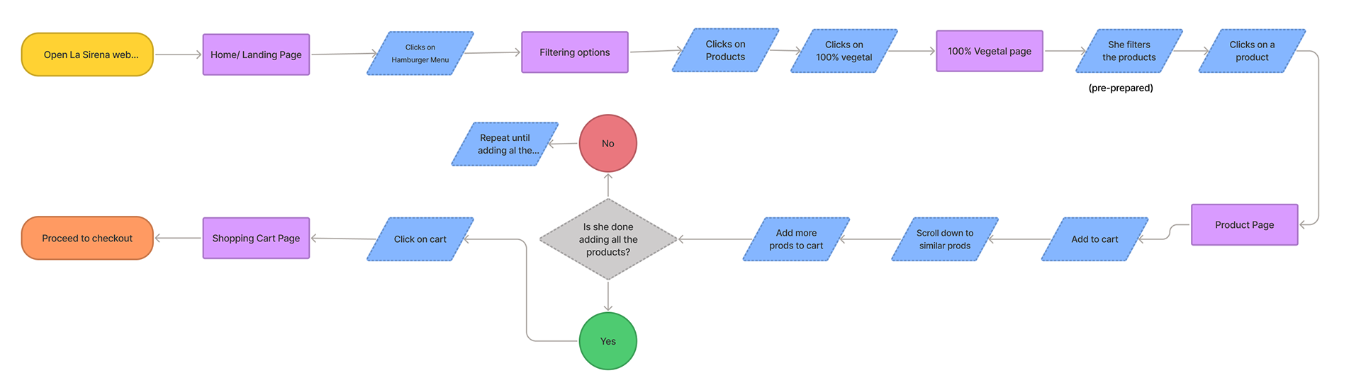
User flow
Via the jobs-to-be-done method, we wanted to see what main job we could base our user flow on. We focussed on filtering products and adding desired products to the basket.
Pre-condition:
Carmen has set up an account with La Sirena and is already logged in.
Carmen has set up an account with La Sirena and is already logged in.
Ideation
Searching for ideas
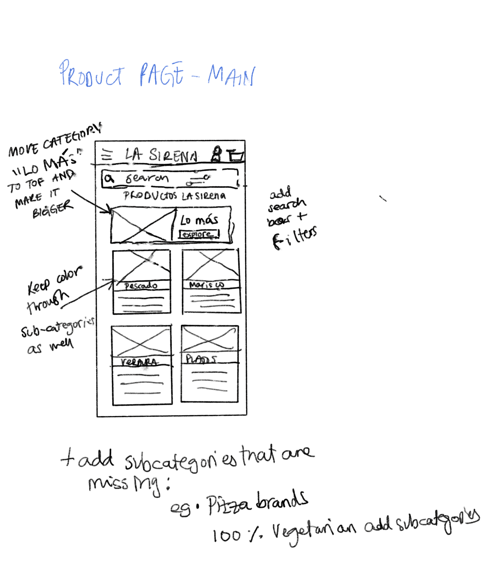
With the structure mapped out, it was time to create low-fi’s to get some ideas on paper. We each made our own and communicated to focus on one solution
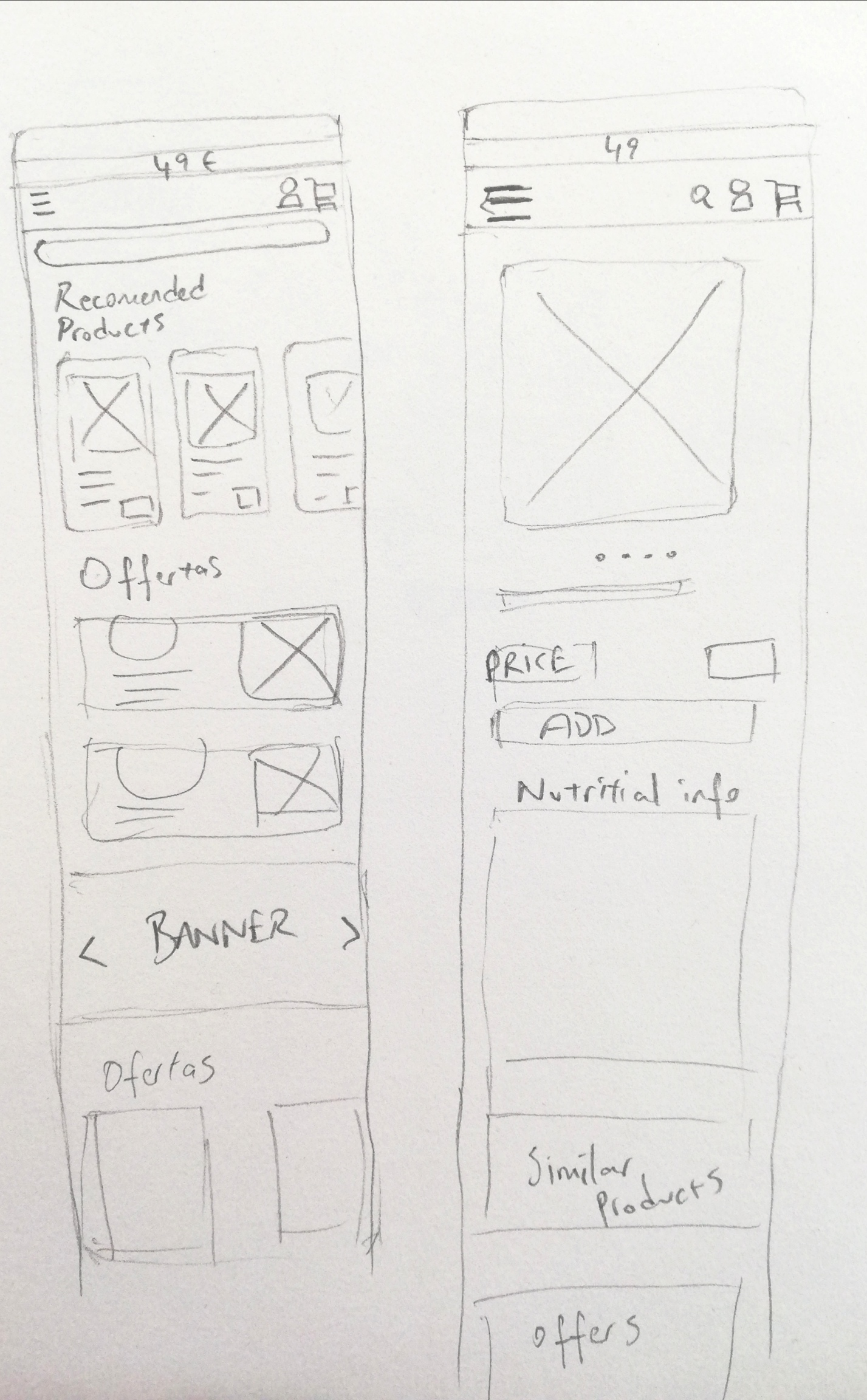
Mid-fi
Here you see a part of the mid-fidelity prototype.The goal is filtering plant based product in the products page and find desired vegan product.
Results
We put the mid-fi up for usability testing and gave the participants five tasks to complete along with a couple of questions.
1. Filter plant-based products
2. Filter vegan products
3. Sort to best seller
4. add a product to your basket
5. complete your order
Success rate 100%
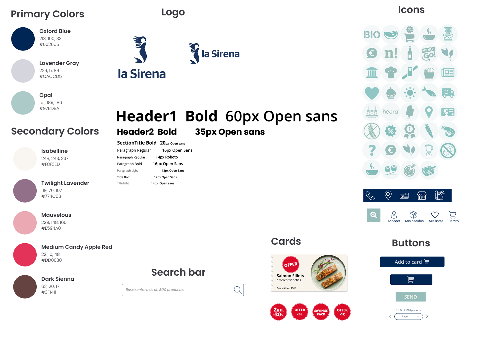
Styleguide
We used La Sirena's existing style guide and design principles
Solution
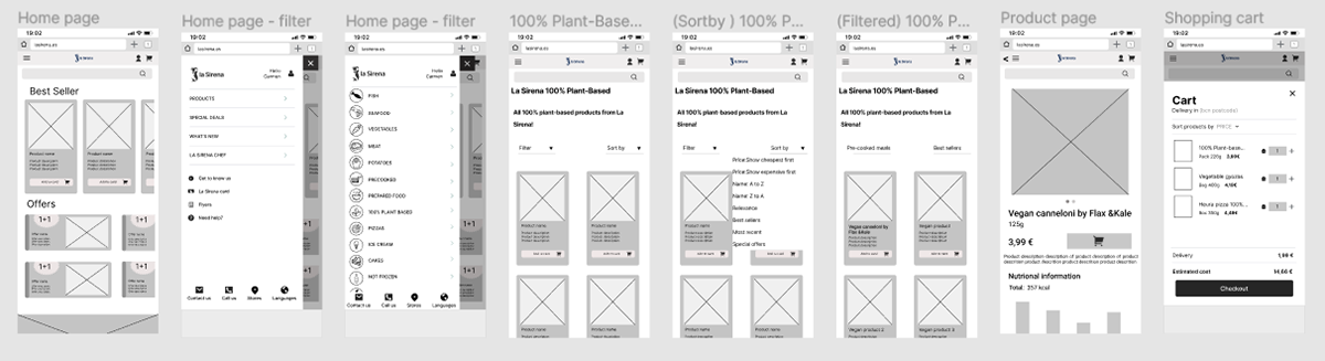
High fidelity prototype
We used our mid-fi results to include changes in our high-fi and styled our prototype with the help of our Style Guide.
Here are some screens from our high-fidelity prototype
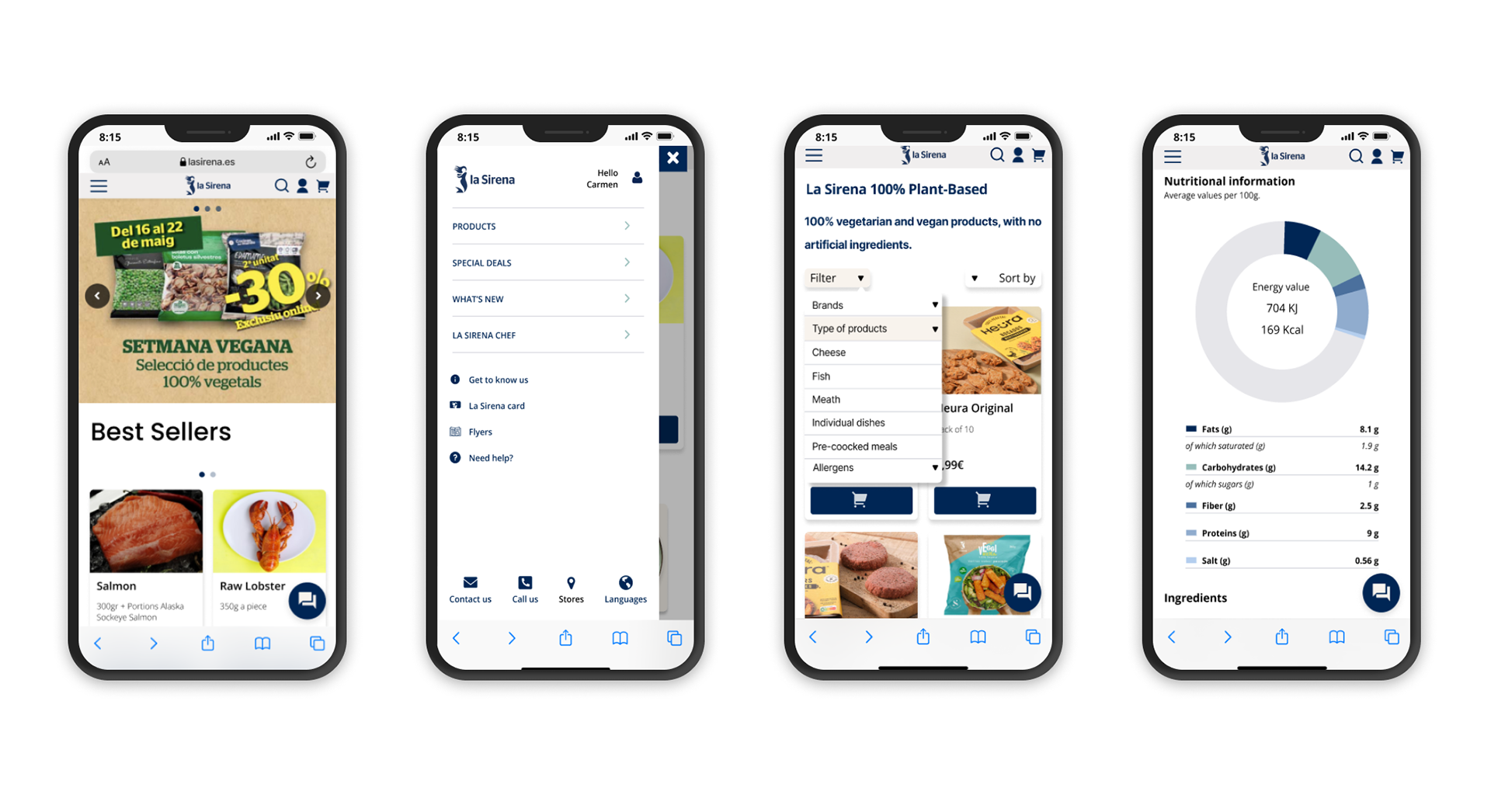
Here are our high-fidelity prototypes in action.
Conclusion
Key Takeaways
We managed to increase success rate by 200%
Working with the stakeholder was a challenge because it is an existing brand.
Final product needs to be La Sirena’s tone
Dealing with the real companies problems taught a lot
Dealing with the real companies problems taught a lot
Next steps
Implementing our solution on La Sirena’s mobile web page and making the AB test
Thanks for reading